Bourbon, too, has found in airports a space for cultural expression.
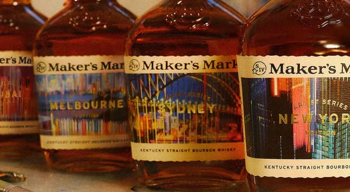
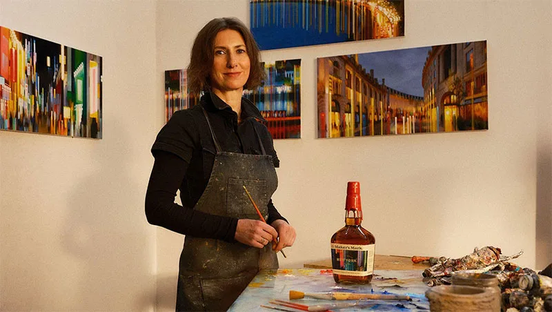
Maker’s Mark, one of the most recognisable names in Kentucky American whiskey, has unveiled an exclusive travel retail series that brings together spirit, graphic design and travel memories. Called Artist Series – City Edition, the initiative features bottles with labels inspired by major international cities, created by artist Alexandra Pacula.
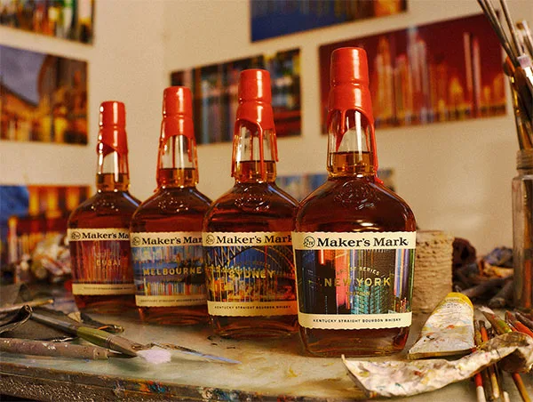
The collection is part of an increasingly visible trend in the duty free channel: special editions that go beyond simply changing the box and aim to offer travellers a piece linked to a specific experience. In this case, the bottle keeps Maker’s Mark bourbon at centre stage, while adding a visual reading connected to destinations such as New York, Los Angeles, Paris, London, Dubai, Delhi, Mumbai, Singapore, Seoul, Sydney and Melbourne.
A recognisable bourbon with a new artistic skin
Maker’s Mark holds a distinctive place in bourbon thanks to its craft-led identity and easily identifiable visual cues, including the red wax seal that finishes each bottle. The brand, owned by Suntory Global Spirits, has built much of its personality around careful production, the approachable character of its sensory profile and an image that refers both to Kentucky tradition and to a contemporary sensibility.
The Artist Series – City Edition does not alter the whisky’s central role, but it does introduce a narrative layer. Each label is designed to work as a travel keepsake, a collectible object and a nod to the particular energy of a city. Compared with the sector’s usual limited editions, often centred on casks, vintages or special finishes, the focus here shifts towards design and the emotional connection between destination and consumer.
Alexandra Pacula and the city as liquid inspiration
The choice of Alexandra Pacula is consistent with the concept behind the series. Her work is defined by a painterly treatment of urban movement, with images that evoke lights, rhythm, traffic, reflections and nocturnal atmospheres. It is a visual language close to long-exposure photography, but transferred to canvas through layers of colour and dynamic compositions.
Applied to a bourbon label, that approach turns each city into an impression rather than a literal postcard. The aim is not to reproduce monuments in a conventional way, but to suggest the pulse of each place: the luminous density of a great avenue, the contrast between architecture and movement, or that sense of transit that defines global capitals. The presence of hand-painted details related to the Maker’s Mark wax seal also strengthens the link between the artistic intervention and the brand’s historic identity.
Travel retail as a showcase for premium spirits
The launch is aimed at the travel retail channel, a particularly important space for premium spirits. Airports allow brands to reach international consumers in a setting that encourages discovery: travellers have time, look for gifts, compare references and pay attention to products they may not always find in their domestic market.
In recent years, this channel has moved away from a mindset focused almost entirely on price and bottle size towards a more experience-led approach. Exclusive releases, gift packs, artist collaborations and destination-linked proposals have all gained ground. For shoppers, the appeal is no longer just about buying a bottle, but about taking home something connected to the journey and hard to find outside that setting.
In that context, a series such as Maker’s Mark fits neatly into several trends at once:
- Geographical exclusivity: bottles available in selected airports, with a direct link to the city of purchase or transit.
- Collectible value: distinctive labels that encourage buyers to keep the bottle even after enjoying the bourbon.
- Emotional connection: a design tied to the memory of a destination, beyond the product category itself.
- Premiumisation: refined presentation and artistic collaboration as part of the perceived value.
What Maker’s Mark brings to the world of bourbon
To understand the appeal of this edition, it is worth recalling what Maker’s Mark represents within bourbon. Bourbon is an American whiskey made primarily from corn and aged in new charred oak barrels. Although the category allows for different nuances depending on the grain recipe, fermentation, distillation and maturation, it is commonly associated with notes of vanilla, caramel, sweet spice, toasted wood and grain.
Maker’s Mark has traditionally stood out for its approachable, rounded style, partly linked to the use of wheat as the secondary grain instead of rye in its recipe. That detail tends to bring a softer texture and a less sharp spicy expression than in other bourbons. It is a profile that works well neat, over ice or in classic cocktails, especially in serves where the whiskey remains centre stage.
In an art-edition bottle, that recognisable character is essential: the consumer is not buying a design alone, but a brand with an established liquid identity. The visual treatment adds storytelling, yet the value of the proposal also rests on the trust that the Maker’s Mark name inspires among bourbon enthusiasts and occasional buyers alike.
From New York to Singapore: cities turned into labels
The series starts from a selection of destinations with a strong presence in the international travel imagination. Cities such as London, Paris and New York carry immediate symbolic weight; others, including Dubai, Singapore, Mumbai and Seoul, reflect the growing importance of major air and commercial hubs across Asia and the Middle East. Sydney and Melbourne complete the map with a reading linked to Australian dynamism and its role in international traffic.
Beyond the list of airports, what matters is the idea of the bottle as an extension of the trip. Instead of a generic label, the buyer finds a visual interpretation of a specific destination. As a gift, it can strengthen the connection with a city visited; for a collector, it adds the appeal of bringing together several versions within the same series; for the bourbon lover, it adds an aesthetic reason to choose a familiar reference.
How to enjoy a bottle from this series
Although the artistic element takes centre stage, it is worth remembering that this is still bourbon. To appreciate it at leisure, a tumbler or tasting glass allows you to explore aromas of sweet grain, wood, vanilla and gentle spice. A small ice cube can open up the drink and soften the alcoholic sensation, while a few drops of water help reveal nuances on the nose.
In cocktails, Maker’s Mark can be used in classics such as the Old Fashioned, Whiskey Sour or Manhattan, provided you are looking for a balanced bourbon profile that is not overly aggressive. For food pairings, it works well with grilled meats, glazed ribs, toasted nuts, milk chocolate or desserts featuring caramel and vanilla.
The Artist Series – City Edition confirms that contemporary bourbon no longer competes solely on recipe, origin or maturation. It also competes through storytelling, design and the ability to connect with travellers looking for bottles with something to say. At that intersection of Kentucky, urban art and international airports, Maker’s Mark finds a different way to strengthen its global presence without giving up its most recognisable codes.